30 July 2009

Columns: How many?

That most posters are wider than tall (landscape layout) means that the text and graphics will be arranged in a series of columns. This number and width of columns is probably the single most important factor in designing a grid for a poster.

How many columns should a poster have?

Some designers find even numbers of divisions too symmetrical and staid, like folded paper. Thus, you may want to try for an odd number of columns, like three of five. Alternately, you might work with a grid that is some multiple of three.

There’s another reason to consider trisecting your poster space. Photographers and graphic artists often talk about the “rule of thirds.” The idea is that the most visually interesting images, pages or photographs often have their focal points off center, at one of the four points formed by intersections of imaginary lines that divide the space into thirds both vertically and horizontally.

This is easier to show than describe.


The red crosses show the preferred points for locating the items of most interest. In photography, these might be the eyes of the face, say. Locating things on those points in a technical poster is a bit more complex, but that’s a post for another time.

If there is any text that is long enough to form a paragraph, the size of the type has a major impact on column width, and therefore column number.

A narrow
skinny
column of
text can
be highly
annoying,
because you
are forced
to keep
sending your
eyes back to
the start of
the line.

Reading extremely wide paragraphs of text makes it easy to lose which line you’re reading as you continue to scan across. I’ve had to make the text very small to show an example of this phenomenon, because I can’t easily adjust the column width for this blog, so I hope you can see the point. Sorry for the eyestrain.

According to Jury (2002), a good guideline for paragraph width, and therefore column width, is about ten to twelve words per line of text. You will find plenty of situations where this guideline is not followed; some magazines have narrower columns, maybe six to eight words wide. Nevertheless, those principles alone probably give you a very solid starting point for a grid.

References

Jury D. 2002. About Face: Reviving the Rules for Typography. Rotavision SA: Mies.

23 July 2009

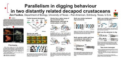
Critique: Crustacean digging

Turnabout, it is said, is fair play. Since I have critiqued other peoples’ posters, I thought I would put up one of my own. Now, obviously, I am going to pick one that I am generally pretty pleased with, but I’m not going to claim it is perfect.

Before I go on to the critique, let me give you a few pieces of information. This poster was done for the Society of Integrative and Comparative Biology (SICB) meeting, which gives one of the most generous poster sizes of any meeting anywhere. It’s something like 230 cm (7 feet, 8 inches) across. Another thing that makes SICB unusual is that they actually request that posters include the abstract on the poster. Many presenters do not do this, but I like to follow guidelines when I know about them.

Faulkes 2002 SICB poster
Even with a few years distance between me and the meeting, there is a lot I like about this poster. The columns are clear and well defined. There are big headings that allow you to take in the gist of each section with a quick read. It is highly visual, with most of the space being take up with pictures. There’s a little colour incorporated into the figures, and it is used consistently. The icons of the species are always the same colour, for example.

Faulkes 2002 SICB poster critiqued
That said, the title is much larger than it needs to be. Looking at it now, I would reduce the title size to give the columns below some more vertical white space.

The small map to the right of the title reflects my insecurity. I had just started a new job at a new university with very little research track record at the time, so I knew “Where’s that?” would be a commonly asked question. It’s a distraction that I should have removed.

I generally hate having abstracts on posters, but I can console myself by saying that SICB made me put it in.

The photo compilations, while neatly aligned, could probably benefit from having a little more white space between each frame.

Now it’s your turn. Does this poster show evidence that I practice what I preach in poster design?

References

Faulkes Z. 2001. Parallelism in digging behaviour in two distantly related decapod crustaceans. American Zoologist 41(6): 1642. Archived at ePosters.net, EP10900.

17 July 2009

Blue collar graphs

At Seth’s Blog, Seth Godin has suggestions for how to make graph that work. His first point, “Don't let popular spreadsheets be in charge of the way you look,” echoes something I wrote recently, which will be a recurring theme here:

Design is all about making decisions.

Because Seth’s specialty is marketing, his advice to make sure every graph tells a story may not always be necessary for a researcher to implement. In research settings, graphs are often used to show details that are pieces of the big picture, whereas in business, the graphs are the big picture.

Finally, Seth is also a fan of being conservative, much like Rob Sawyer is with book layout. Following established conventions helps the viewer. And if you think following conventions limits your creativity, ask if Shakespeare found the rigid rhyming scheme of sonnets too restrictive.

Additional: A follow-up at Charts.

16 July 2009

Review: Scientist’s Guide to Poster Presentations

In my searches, I have found only one book so far that is specifically devoted to poster presentations. It took me a while to get a copy through interlibrary loans to review.

Scientist’s Guide to Poster Presentations is celebrating its tenth anniversary. Unfortunately, like some of the other books I’ve reviewed on poster presentations, it has not aged well.

A lot of advice on the physical construction of the poster is outdated. It presumes the poster has to be physically assembled on paper. So the text goes on at length about glue and straightedges and tape, which is not used very frequently now. The chapters on transporting and putting the poster up has limited usefulness for the same reason.

Some of the text from the final short chapter, “Future Trends,” feels quaint:

Future trends in visual presentation of scientific information in general are likely to change dramatically from 1999 to 2009. ... The Internet, however, is a powerful form of communication that is impossible to ignore. ... I am sure it will not be long before abstracts accessible on the Internet take on a more detailed an elaborate format, possibly including a downloadable image of the whole poster. A note of the author’s e-mail address would enable contact to be made.

Even putting aside that the book shows its age, many of the suggestions in the main text were dubious even when the book was new.

I could not believe the caption accompanying the figure, arguing that the 3-D effect “adds interest to the information being presented.” Edward Tufte had rightfully criticized such effects as chartjunk over a decade earlier in 1983 (new edition in 2001). The figure immediately underneath also made me cringe:

Gosling claims, “Placing a chart at an angle can have a very pleasing effect.” Again, I would direct readers to Tufte over Gosling in a heartbeat. Such distortions are unnecessary at best and misleading at worst.

As a final example, here are a set of Gosling’s suggested layouts:

Although a few of these might be okay, most are not. Most confused me as to whether I should read the blocks left to right or top to bottom. Several cannot decide how many columns wide the grid is.

Gosling writes, “...your flow of information should follow the basic principles of Western languages by reading from left to right first, then from top to bottom, and clockwise if wrapped around a graphic element or the circumference of the poster.”

Clockwise? A design that circles around the edge is probably not a good idea. You never see such things in newspaper, magazines, or books, so you probably should not do it on a poster.

One of the better sections contains pictures of actual posters from conferences. Although this suffers a bit because the pictures are in black and white and fairly low resolution, they definitely serve as good examples of what not to to do.

This is worth a loan from a library, but too dated and too limited to be worth tracking down to purchase.

References

Gosling, PJ. 1999. Scientist’s Guide to Poster Presentations. Kluwer Acedmic / Plenum Publishers: New York. https://doi.org/10.1007/978-1-4615-4761-7. Amazon

Tufte ER. 2001. The Visual Display of Quantitative Information (Second Edition). Graphics Press: Chesire, Connecticut. Amazon

09 July 2009

Sawyer’s rules for layout

Science fiction writer Robert J. Sawyer was talking about books, but he could have just as easily been talking about posters. Sawyer touches on something I discuss a lot here, namely that designing text information takes effort and craft:

Yes, designing books is actually a job – it’s not something you just wing.

Sawyer’s rules for book layout:


  1. Be conservative.

  2. If you haven’t seen somebody else do it that way before, it’s probably a bad idea.

  3. Actually have a published book at your side while designing your own – to see how it’s done.

  4. Don’t suck.


I would add to #2, “Even if you have seen somebody do it that way, it could still be a bad idea.” This is particularly true for science and research posters, because so many are made by people who are doing their best, but are ultimately winging it.

Critique: Oligonucleotides

This poster, by Peter Guterstam and Ülo Langel, was featured on ePosters.net as an award winning poster at a conference in September 2008. Typically, such awards are given for the science as well as the graphics, but here, let’s examine it for just the visual impact.

Guterstam and Langel poster
From the point of view of pure visual impact, this is very disappointing.

The first author’s name is underlined in a couple of places. Underlining is not a good way of emphasizing, because the horizontal line obscures the shape of the descending letters. Bold or italicizing is usually better. Perhaps the conference organizers specified that the presenting author must underline the name?

The layout is unattractive, with a strange split between a two column layout at the top and a three column layout underneath. This might work if there were better alignment, but the margins of the top columns are wider than those of the bottom.

The flow is so poor that the authors had to draw a dividing line – a zigging, zagging, dividing line – to show readers where to go next and prevent someone from wandering into the figures accidentally.

Similarly, having the conclusion in the middle of the poster is rather strange. Normally, people will be looking for the end of the poster in the lower right hand corner. That’s where we end up every time we read a page of a book or magazine or newspaper.

The text is large and mostly quite legible. If the text is high contrast enough to be printed against a blue background, however, why are the figures printed in black ink against a white background? For that matter, why is the table set in serif font when the rest of the poster is set in sans serif?

Guterstam and Langel poster critique.jpg
Finally, the figure captions are in odd places, and generally do not leave enough space between the figure and the text. This is particularly true in the lower left hand corner. The text and picture almost touching in the horizontal is more puzzling, given that there is a fairly large gap above the picture.

02 July 2009

The great divide

There are two kinds of typefaces in the English language, and ne’er the twain shall meet. Serif and sans serif. The typical claim is that serifs make letters more distinctive and easier to read when set in long sequences of fairly small text (like books), but that sans serif makes letters easier to read when set in short sequences of fairly large text (like posters).

You will find many, many, many people and books and websites that tell you with great certainty that you should use sans serif typefaces for posters. For example, Mary Briscoe claims in Preparing Scientific Illustrations:

A serif type can be distracting, especially in a large title.

Why this should be so is, sadly, never explored or explained.

Michael Alley writes in The Craft of Scientific Presentations:

(A) uniform font such as Arial is appropriate. The presenter should avoid a font such as Garamond that has thin strokes.

Nancy Duarte in Slide:ology may have been talking about slides, but the reasons she advocates sans serif would also apply to posters:

The debate still rages about which type is most suited for legibility. ... I conducted my own research from the 28th floor of a Las Vegas hotel. ... Out of the 40 or so billboards visible from the hotel room, the only ones I could read were set in sans serif type.

These all claim that sans serif is more legible for tasks where the words are few, the print is large, and distance to the reader is great. And that pretty much describes posters to a ‘T’.

Even those that advocate serif typefaces for the main text will suggest using serif type for big text. Colin Purrington's Advice on designing scientific posters argues:

Use a non-serif font (e.g., Helvetica) for title and headings and a serif font (e.g., Palatino) for body text (serif-style fonts are much easier to read at smaller font sizes).

Similarly, Creating effective poster presentations advises, “Use a serif font (e.g., Times) for most text – easier to read,”, but in the very next bullet says, “Sans-serif (sic) font (e.g., Helvetica) OK for titles and headings.”

Surely all those smart people must be on to something. Indeed, when I look back at my own posters, most of them have been set in a sans serif typeface, and it’s partly why this blog features a lot of sans serif at the moment.

Should posters always use a sans serif typeface? Not necessarily. There are good reasons to use a serif typeface for a poster, the most important being:

Because you like it.

I appreciate this post from the I Love Typography blog, which says in part:

In my opinion, a lot of time is wasted attempting to prove that one is better than the other for setting extended text. I suggest that you ignore the vague and inconclusive findings of such ramblings and decide for yourself.

For posters in particular, the legibility of text is not determined so much by the little extensions from the letters, but by the size of the print. If you make it big enough, people will be able to read it.

Design is all about making decisions. It’s all too easy to fall into a “default” mode, and use the same things over and over without really making any explicit decisions of your own.

Pictured: Will Eisner’s femme fatale Sand Serif, from The Spirit, whose name is a typographical pun. Serif ‘A’ from Eva the Weaver on Flickr, used under a Creative Commons license.